Google has always been at the forefront of design innovation, and its latest step forward is no exception. The tech giant’s latest update, part of its Material 3 Expressive (M3E) design language, introduces a new loading indicator that promises to change the way we perceive waiting on our devices. This update, which already makes its debut in Android 16, is a move towards improving user experience and making even the waiting moments more engaging.
What Is Material 3 Expressive’s New Loading Indicator?
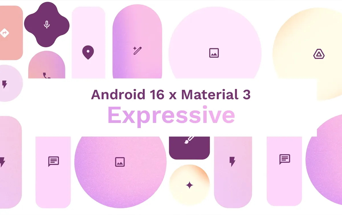
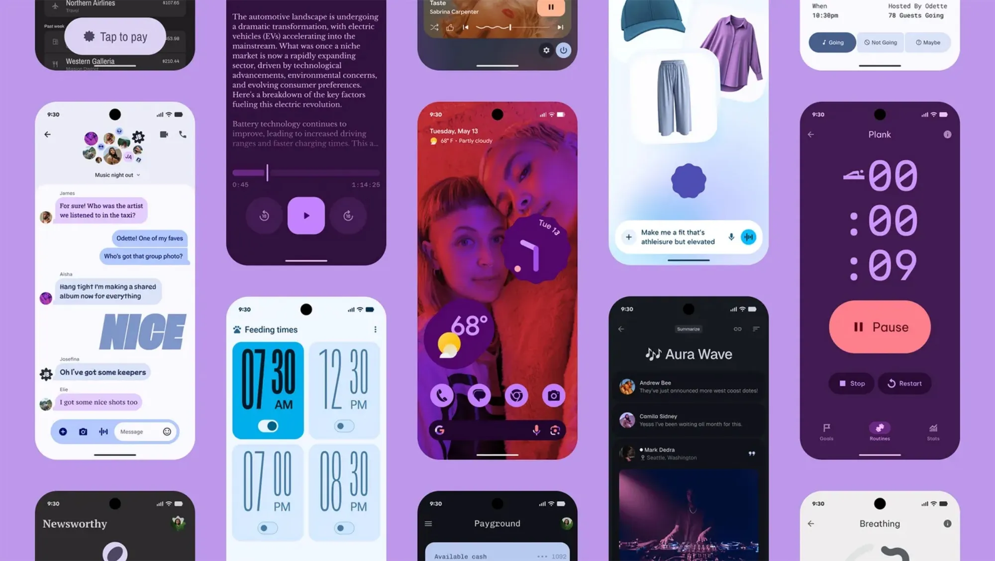
In the past, loading indicators on Android devices were fairly standard — a simple, looping progress circle that indicated a wait. However, Google’s latest overhaul aims to make waiting more visually engaging and meaningful. The Material 3 Expressive (M3E) design refresh introduces a loading indicator that’s not just functional but also visually dynamic.
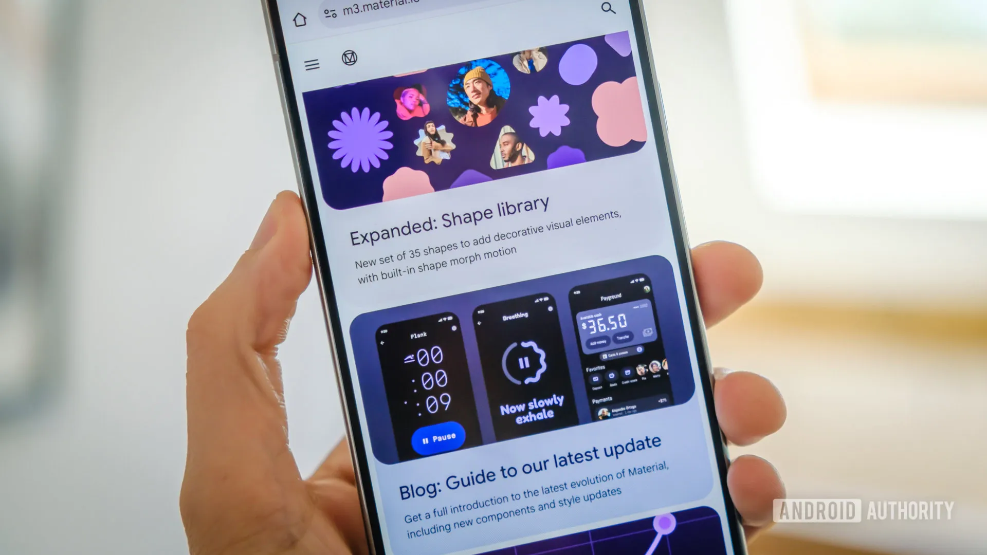
This new loading indicator is designed to capture your attention, offering a unique animation that combines multiple shapes, a key feature of M3E. The loading sequence consists of a looping shape morph sequence made from seven distinct shapes, a small part of the 35 shapes present in the entire Material 3 Expressive library. The result is a progress indicator that’s far more captivating than the traditional, static circular progress bars we’ve grown accustomed to.
A Shift in How We View Progress
What makes this new loading indicator so special? For one, it’s specifically designed to handle short wait times — less than five seconds. In the past, circular progress indicators were commonly used for tasks that felt indeterminate or took longer to load. But the new Material 3 Expressive indicator is aimed at addressing the smaller, more immediate delays in a much more visually appealing way.
Google’s design team even recommends using this updated loading indicator to replace the indeterminate circular progress indicators seen in previous Material 3 (and Material 2) versions. The goal is to bring more life to the waiting experience while still being informative about the progress being made.
When and Where Can You See This Loading Indicator?
Android 16 Beta users can already experience the new loading indicator firsthand. After a device reboots and you enter your PIN, you’ll notice this new visual cue while waiting for the Pixel Launcher or homescreen to load. This change is subtle but noticeable, demonstrating how even small, everyday moments in the device interface can be enhanced with design innovation.
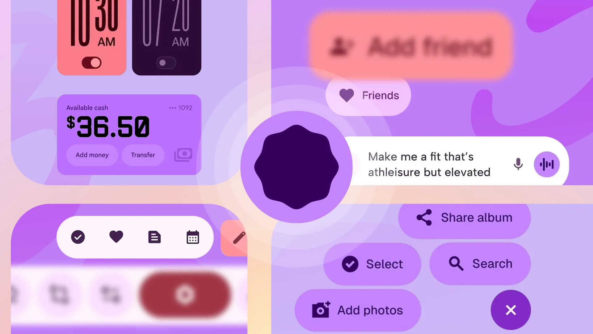
However, the M3E loading indicator is versatile, and it can be used outside of its traditional pull-to-refresh function. Google has made sure this new feature isn’t limited to just one use case. In fact, it can be incorporated in a variety of contexts, such as within buttons to indicate ongoing actions like form validation or checking for updates. This versatility ensures that the loading indicator feels integrated into the overall user experience, no matter the scenario.
Replacing the Favicon with the New Loading Indicator
In addition to its use within apps and interfaces, the new loading indicator is also making its way into browser interactions. When a browser page is loading, the Material 3 Expressive indicator can even replace the typical favicon to show progress. This makes it a seamless experience across the entire ecosystem — from apps to web browsing.
The idea behind this is clear: Google wants to transform even the smallest moments into part of the overall user experience, making waiting for something feel more like an engaging interaction rather than an inconvenience.
Bigger Updates for Longer Waits
For those longer loading processes that take more than five seconds, the Material 3 Expressive update doesn’t leave us hanging with the new indicator alone. Google has also revamped both the linear and circular progress indicators, which are now thicker in design and feature a wavy shape. The wavy shape offers a more dynamic and expressive style, making longer wait times feel less static. As Google points out, this design element is best suited for moments when a more expressive, engaging style is required — like when an app is validating data or downloading large files.
Why This Matters for Users
This update is not just about aesthetics; it’s about improving the waiting experience on mobile devices. In an era where user engagement is key, even the act of waiting for something to load should be handled with care and creativity. The Material 3 Expressive loading indicator, with its unique animation and flexibility, takes steps toward making these moments more visually appealing and informative, all while staying true to Google’s philosophy of user-centric design.
The redesign makes the progress indicators feel more integrated into the apps’ natural flow and creates a smoother, more immersive experience for users. Whether you’re waiting for a quick app refresh or a longer download, these new indicators will help make the process feel more dynamic and engaging.
The Future of Material 3 Expressive
With Android 16 rolling out, Google’s introduction of Material 3 Expressive is set to redefine the way we think about loading animations. Google’s commitment to user experience is clear, and as this new design language spreads throughout the Android ecosystem, users can expect to see more updates that prioritize engagement and usability in new and unexpected ways.
As more devices adopt Android 16 and developers begin to integrate M3E loading indicators, we will undoubtedly see a more interactive, expressive digital experience. Google’s push toward enhancing every aspect of the interface, no matter how small, is an exciting sign of where mobile design is heading in the near future.


